Six Step Portfolio Risk Analysis Workflow for Practitioners Using AI
A practitioner workflow to turn holdings into action: six key risk metrics, a six step analysis, scenario tests, and AI monitoring to spot risk drift.
Six Step Portfolio Risk Analysis Workflow for Practitioners Using AI

Portfolio risk analysis converts a scattered list of holdings into a quantified view of what could go wrong, how badly, and what to do about it. The output is three things: an exposure summary showing concentration and correlation, a set of metrics like volatility and tail risk that put numbers on uncertainty, and a short list of recommended actions, from rebalancing to hedging. Investors and advisors run this analysis to move from a gut feeling about risk to a defensible, repeatable process. The step-by-step version starts below.
TL;DR:
- Using both parametric and historical VaR estimates can reveal fat tails and stress periods your models might underestimate.
- Portfolio risk metrics like R-squared and beta should be evaluated together, with R-squared below 0.5 rendering alpha and beta less meaningful.
- Risk profiling must consider need, capacity, and behavioral tolerance separately, as misalignment can lead to unintended exposure.
- Conducting regular correlation updates, ideally monthly, is vital to capturing regime shifts and avoiding false diversification signals.
- Incorporating qualitative factors such as management quality and industry risks enhances quantitative models and prevents underestimating hidden threats.
Table of Contents
- Key Risk Metrics Every Investor Should Track
- VaR, CVaR, CAPM, and the Efficient Frontier Compared
- Matching Risk Analysis to the Investor's Actual Risk Profile
- How to Run a Portfolio Risk Analysis Step by Step
- Where Spreadsheets, Python, and Trackers Each Fit
- Limitations and Assumptions of Portfolio Risk Models
- Scenario Analysis and Macroeconomic Factor Impacts
- Bringing Qualitative Risk Factors Into the Analysis
- Risk Budgeting and Allocation in Practice
- Vincent's Practitioner Notes on Hidden Risk
- Let Evibe Handle the Data So You Can Focus on the Decisions
- Sources
Key Risk Metrics Every Investor Should Track
Six numbers do most of the work in portfolio risk analysis, and each answers a different question. Alpha tells you whether a manager or strategy beat its benchmark after adjusting for market exposure. Beta measures sensitivity to that benchmark, indicating how much the portfolio tends to move relative to the market. R-squared shows how much of a portfolio's movement is explained by the benchmark at all, and this one gets skipped more than it should.
That last point matters more than most guides admit. Investopedia's breakdown of the five principal risk measures groups alpha, beta, R-squared, standard deviation, and the Sharpe ratio together for a reason: they're meant to be read as a set, not cherry-picked. A portfolio with an R-squared below 0.5 has a beta and alpha that are close to meaningless, because the benchmark isn't actually explaining its behavior.
Standard deviation captures total volatility, both the upside and downside swings, while the Sharpe ratio measures return earned per unit of that volatility. The Sortino ratio refines this by only penalizing downside deviation, which suits investors who don't mind big up months but want to avoid big down ones.
- Alpha and beta: use together, and only after checking R-squared.
- Standard deviation: best for comparing overall volatility across similar asset classes.
- Sharpe ratio: useful for ranking strategies with similar risk profiles.
- Sortino ratio: better for downside-focused or income-oriented portfolios.
Pro Tip: Never compare Sharpe ratios across asset classes with wildly different volatility regimes. A Sharpe ratio of 0.8 on a bond fund and 0.8 on a small-cap growth fund are not comparable achievements.
VaR, CVaR, CAPM, and the Efficient Frontier Compared
Value at Risk and Conditional Value at Risk both quantify tail risk, but they answer different questions. VaR estimates the worst loss you'd expect at a given confidence level over a set horizon. CVaR, also called Expected Shortfall, measures the average loss beyond that VaR threshold, capturing how bad things get once you're already in the tail. A 95% VaR of $50,000 tells you the threshold; CVaR tells you what happens on the other side of it.
Three methods produce VaR, and they diverge fastest during stress. Parametric VaR assumes returns follow a normal distribution, which is fast to compute but understates fat-tail risk. Historical VaR replays actual past returns, so it captures real crashes but assumes the future resembles the past. Monte Carlo VaR simulates thousands of possible paths using assumed distributions and correlations, which handles nonlinear positions like options better than the other two, as illustrated by open-source portfolio risk analyzer tools that run all three side by side.
CAPM and the Markowitz efficient frontier serve allocation rather than measurement. CAPM estimates a required return given a risk-free rate and market risk premium, work grounded in Damodaran's risk premium framework at NYU Stern. The efficient frontier then maps the combinations of assets that deliver the highest return for a given level of risk, or the lowest risk for a given return.
- VaR sets a loss threshold; CVaR sizes the damage beyond it.
- Historical VaR trusts the past; Monte Carlo VaR builds hypothetical futures.
- CAPM sets the return bar; the efficient frontier finds the mix that clears it most efficiently.
Pro Tip: Run VaR both parametrically and historically on the same portfolio. A wide gap between the two numbers is itself a signal that your return distribution has fatter tails than a standard model assumes.
Matching Risk Analysis to the Investor's Actual Risk Profile
A volatility number means nothing until it's matched to the person holding the portfolio. The CFA Institute's framework for investment risk profiling breaks this into three distinct dimensions that rarely align neatly.
- Risk need is the volatility and return required to meet a financial goal, derived mathematically from the target return.
- Risk capacity is the objective ability to absorb losses, based on time horizon, income stability, and liquidity needs.
- Behavioral tolerance is the subjective, often irrational, comfort with seeing account values drop.
Converting a target return into a volatility target and a drawdown budget forces these three into the same units. A retiree drawing 4% annually might have low risk capacity (short horizon, needs the cash) even if their behavioral tolerance is high from decades of market experience. A 30-year-old with a demanding job and unstable income might have high theoretical capacity but low behavioral tolerance after living through two bear markets. The CFA framework's core warning, echoed across practitioner guidance, is not to let a single psychometric quiz score override the other two dimensions.
How to Run a Portfolio Risk Analysis Step by Step
Running this analysis well is less about sophisticated math and more about sequencing. Skip a step and the output looks fine but misleads you.
- Collect and clean data. Pull positions, cost basis, and price history for every holding, plus a matched benchmark. Corporate actions like splits and spinoffs need adjusting before any metric is trustworthy.
- Pick your horizon and frequency. Daily data suits active traders; monthly data suits long-term allocators. Mismatched frequency between the portfolio and benchmark corrupts beta calculations.
- Select metrics for the decision at hand. Setting position limits calls for VaR and correlation data. Tail planning calls for CVaR and Monte Carlo. Rebalancing calls for tracking drift against target allocation.
- Build the correlation matrix. Pairwise correlations reveal which "diversified" positions actually move together, a step Morgan Stanley's risk management guidance treats as essential to spotting risks that isolated metrics miss.
- Run the stress scenarios. Monte Carlo simulation and historical stress tests show how the current allocation would have performed in 2008, 2020, or a rate shock scenario.
- Convert findings into action. Set rebalance triggers, flag hedging candidates for concentrated positions, and schedule the next review.
Pro Tip: Treat correlation as a rolling number, not a fixed one. Assets that were uncorrelated for a decade can move in lockstep during a liquidity crisis, which is exactly when you need the diversification most.
Practical guidance from Investing.com Academy recommends a formal annual review at minimum, with ad hoc re-checks after major life events or market dislocations.
Where Spreadsheets, Python, and Trackers Each Fit
Spreadsheets still handle one-off analysis well, especially for smaller portfolios where a single analyst wants full control over the formulas. Python libraries like NumPy and pandas take over once you need Monte Carlo simulation across thousands of paths or custom correlation modeling that a spreadsheet can't handle without freezing.
The gap in both approaches is the data itself. Getting clean price history, FX conversion, corporate action adjustments, options Greeks, and liquidity data into one place usually takes longer than the actual risk math. That's the problem consolidated tracking apps solve.
Evibe fits into this workflow at the monitoring layer. It syncs stocks, ETFs, options, crypto, and real estate from banks and brokerages automatically, which removes the manual data-wrangling step entirely. Its AI-driven analysis surfaces diversification and risk flags without requiring the user to build a model from scratch, and correlation views highlight concentration that a simple holdings list would hide.
- Spreadsheets: best for quick, transparent, one-time analysis.
- Python toolkits: best for Monte Carlo, custom factor models, and large simulations.
- Consolidated trackers: best for ongoing monitoring, multi-asset sync, and catching risk drift between formal reviews.
Limitations and Assumptions of Portfolio Risk Models
Every model here runs on assumptions that hold until they don't. Standard deviation and parametric VaR generally assume returns follow something close to a normal distribution, but real markets exhibit fat tails, meaning extreme moves happen more often than a bell curve predicts. That assumption failure is exactly why 2008 and March 2020 blew past what parametric VaR models projected for those periods.

Correlation estimates carry a similar flaw. They're calculated from historical data and tend to be unstable, often rising sharply during crises exactly when diversification matters most. A correlation matrix built from five calm years can understate how connected your holdings really are.
CAPM's beta assumes a linear relationship between an asset and the market that breaks down for options, structured products, and other nonlinear instruments. Monte Carlo simulation improves on this by generating many possible paths, but it's only as good as the return distributions and correlations fed into it. Garbage assumptions in, garbage risk estimates out.
Backward-looking data is the deepest limitation across all of it. Every metric described so far, from beta to Sharpe ratio to historical VaR, describes what already happened. None of them predict a regime change, a liquidity crunch, or a new kind of shock the historical window never contained. That's not a reason to skip quantitative analysis. It's a reason to pair it with scenario planning and qualitative judgment rather than treating a single number as gospel.
Scenario Analysis and Macroeconomic Factor Impacts
Scenario analysis fills the gap that historical models leave open by asking "what if" instead of "what happened." A well-built scenario set runs the current portfolio through a rate shock, a recession, a currency crisis, and a sector-specific shock, then reports the estimated impact on total value and on individual positions.
Macroeconomic factors drive most of these scenarios. Rising interest rates typically compress valuations for long-duration growth stocks and bonds while often benefiting financials. A weakening dollar tends to lift returns on unhedged international holdings for a US-based investor, while a strengthening dollar erodes them. Inflation spikes hit fixed-income holders directly through purchasing power loss and can compress margins for companies without pricing power.
The practical value of scenario work shows up in position sizing, not prediction. Nobody can reliably forecast the next rate decision or geopolitical shock, but a portfolio manager can size positions so that a plausible bad scenario doesn't produce an unacceptable loss. If a 200 basis point rate shock scenario shows a 22% portfolio decline, that number itself is the useful output. It tells you whether your current duration exposure matches your actual risk capacity.
Factor sensitivity analysis complements this by isolating exposure to specific macro drivers, interest rates, oil prices, dollar strength, rather than lumping everything into one blended volatility number. A portfolio can have modest overall volatility while carrying concentrated exposure to a single factor, like rate sensitivity, that a blended number would never reveal on its own.
Bringing Qualitative Risk Factors Into the Analysis
Numbers miss things that a careful reader of the news doesn't. Management quality, regulatory exposure, geopolitical risk, and industry disruption rarely show up in historical price data until after they've already caused damage, and by then the quantitative metrics are simply confirming what already happened.
Concentration risk hiding behind sector labels is a common qualitative catch. A portfolio might look diversified across ten holdings with a standard-deviation reading that seems reasonable, but if eight of those ten depend on the same supply chain or the same regulatory approval, the real risk is far higher than any correlation matrix built from price data alone will show.
Practical integration means layering a qualitative checklist onto the quantitative output rather than replacing it. Before finalizing any risk assessment, ask whether a single regulatory decision, litigation outcome, or management change could move more than one position at once. Ask whether recent price stability reflects genuine business stability or just a lack of news flow. These questions don't produce a number, but they change how much weight to put on the numbers that do exist. A portfolio with a low headline volatility reading and a concentrated exposure to a single pending court case is not actually low risk. It's low risk until a specific date on a calendar.

Risk Budgeting and Allocation in Practice
Risk budgeting flips the usual allocation question. Instead of asking how much money to put in each asset, it asks how much of the portfolio's total risk each position is allowed to contribute. A position can be a small dollar amount but a large share of total portfolio volatility if it's highly volatile or poorly correlated with the rest, and risk budgeting surfaces exactly that mismatch.
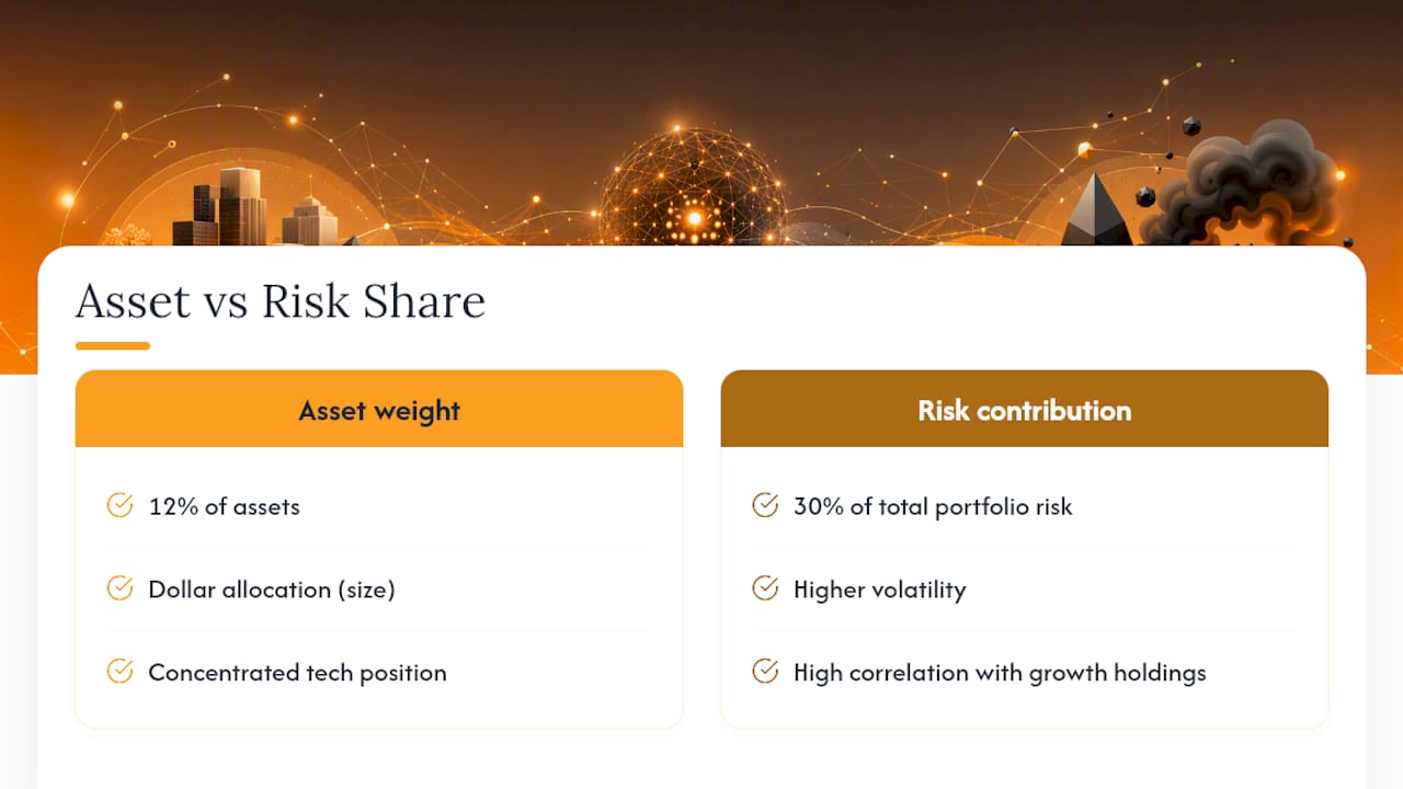
The mechanics start with calculating each position's contribution to total portfolio variance, which depends on its own volatility and its correlation with everything else. A concentrated tech position might represent 12% of assets but 30% of total portfolio risk once its higher volatility and correlation with other growth holdings gets factored in.
Setting the budget itself flows from the investor's risk capacity established during profiling. If the drawdown budget allows for a 15% maximum decline in a bad scenario, each asset class and position gets a risk allocation that sums to stay under that ceiling, rather than an arbitrary dollar allocation like "60/40." Equal-weighting by dollar amount and equal-weighting by risk contribution produce very different portfolios, and the risk-weighted version tends to survive volatility spikes with smaller drawdowns because no single factor dominates the outcome.
Vincent's Practitioner Notes on Hidden Risk
The mistake I see most often isn't a missing metric, it's stale correlation data treated as current. Diversification built on a five-year-old correlation matrix quietly breaks down the moment a new macro regime takes hold, and most investors don't notice until the drawdown already happened.
Re-run correlations monthly, not annually. Regime shifts move faster than review cycles, and the positions you thought were uncorrelated are usually the ones that fail together.
— Vincent
Let Evibe Handle the Data So You Can Focus on the Decisions
Evibe exists because the hardest part of portfolio risk analysis usually isn't the math, it's getting clean, current data into one place before you can even run the math. Evibe automates that step by syncing stocks, ETFs, options, crypto, and real estate directly from banks and brokerages, then layers AI-driven analysis on top to flag concentration, diversification gaps, and risk drift as they happen.

Correlation heatmaps update automatically as positions change, so you catch a hidden concentration before it becomes a drawdown rather than after. Smart alerts flag meaningful shifts in your risk profile, and benchmarking tools show how your actual portfolio, not a model portfolio, stacks up against major indices in real time.
If you're managing stock positions across multiple brokerages and want a single view of what's really driving your risk, start with the stock portfolio tracker and see your consolidated exposure the same day you connect your accounts.
This article is general information, not a substitute for advice from a qualified financial advisor. Consult a qualified financial professional about your own circumstances before acting on anything here.
Sources
- What Are the 5 Principal Risk Measures and How Do They Work? — Investopedia
- Investment risk profiling — CFA Institute
- Damodaran notes on risk premium and CAPM — NYU Stern
- Portfolio risk management: Mitigating risks — Morgan Stanley